How do you facilitate accessible design in e-learning?
Published: 6th March 2023By: Lasse Hamre
Interactivity on screens can be a challenge for many. Imagine how complicated some exercises could be if you can't see the screen clearly. Here are ten tips for creating inclusive and accessible e-learning experiences for people with sight or hearing impairments, physical challenges, learning difficulties and concentration issues.
When e-learning doesn’t meet the needs of all users, large groups of people are excluded from fully experiencing – and therefore learning from – the knowledge being shared. That is why the EU has come up with The EU Web Accessibility Directive (WAD) to ensure the universal design of public websites and mobile applications. This means that many e-learning courses must be revisited and improved, and new courses must be developed in alignment with these requirements.
Universal design isn’t difficult once you know the recipe for making e-learning accessible to everyone, and here are some simple steps to create a more inclusive digital training offer:
1. Facilitate text-to-speech
Text-to-speech technology gives users the opportunity to have the content read to them. By following the rest of the tips below, you will also ensure the content can be easily understood when using this technology.
2. Write plain language. Write simply.
Plain language is communication with clear wording, sentence structure and grammatical structure so that readers can find the information they need, understand it and can use it. Use active language. Active language means that in the vast majority of sentences someone (subject) is doing something (verb). Short sentences are fine. Use simple words that everyone understands. Avoid internal jargon, abbreviations and technical terms.
3. Use headings and subheadings

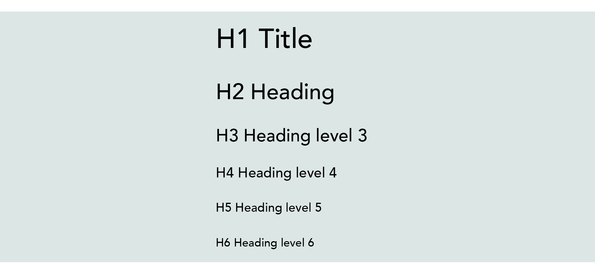
Use heading and subheadings to organise the content for accessibility.
Organise and structure your content with systematic use of headings and subheadings. This makes it easier for the user to navigate and understand the content. In many authoring tools, you can mark the main heading with H1 and then H2, H3, and so on, to mark the appropriate heading level. It is important to convey the message in this logical, structured way to a user who uses the tab key to navigate the experience.
4. Use descriptive captions and alt text
Descriptive captions will help to explain pictures, charts and figures for users who may be blind or partially sighted. Use alt text to provide a text-based description of images for those using screen readers.
5. Use tables and lists
Tables and lists help to organise and present information in a clear and easy-to-understand format for all users.
6. Use colours and contrast effectively

Important information may disappear when the image is viewed in greyscale.
Use colours and contrasts to promote your message through the use of images, layout and in text. Remember that the message should still be understandable when viewed in grayscale by participants with colour blindness.
7. Subtitle all videos
Make sure any video content is subtitled. It should provide both descriptions of the visual and audio components of the video. Captioning is a help to people who are deaf or hard of hearing, and to everyone else who wants to learn when, for example, they travel by public transport, and keep their device muted so as to not disturb their fellow passengers.
8. Use keyboard navigation
Make sure the content is navigable using a keyboard only. Some users aren’t able to use a mouse. Test the page afterwards. Are you sure a drag-and-drop task can be manoeuvred with just the keyboard?
9. Choose interactive tasks wisely
Interactive tasks can be especially challenging. Many will need extra time to orient themselves on the page and understand what it is about. Pay particular attention to:
Hotspots on images
The picture and the hotspot together form a comprehensive message to the participant. What happens if you’re not able to see the whole picture?
Drag and drop exercises
Is it possible to find the object and drop it in the right place if the participant has visual impairments? Also consider users with mobility impairments who may have challenges using a mouse.
Carousels and sliders
These exercises can be difficult for visually impaired users to navigate. They will often not get an overview of all the navigation options.
Time limits

Time limitations on game exercises can make the task impossible for some participants.
These put users who have to spend a lot of time orienting themselves on the page in a difficult situation. The exercises can create stress for some users, especially those with learning difficulties or ADHD.
Variants of puzzle games
These exercises can be very demanding for users who aren’t able to see well.
Games and gamification
Games and gamification may favour the sighted and those with strong motor skills. When the users aren’t able to participate on equal terms, the competition will be perceived as unfair.
10. Test and validate the accessibility
Test on a wide and varied group of users to investigate whether the course is actually universally designed. Use different devices and browsers to ensure content is available everywhere. Remember to check keyboard navigation for possible dead ends, and also test how the screen reading works. Thorough testing will reveal any shortcomings and help contribute to a good result.
By following these tips and including accessibility considerations in the design process, e-learning can be made more inclusive and accessible to all users.


